Canyon Ranch has been a big player in the wellness industry for over 40 years, offering guests transformative experiences that combine health and well-being at their destination resorts. To aid in their grown and expansion, Canyon Ranch recognized they needed to fix a clunky and often stressful guest planning and scheduling process.
Guests of Canyon Ranch would be given multiple booklets full of offerings to sift through and find what services and activities they'd like to sign up for prior to their visit. Once they had their list, they'd call a wellness guide to sign up and book their experience. This process was quite tedious for both parties as often services would be booked up or the services that were picked wouldn't be ideal for the guest and they'd have to find alternatives.
Objectives
Canyon Ranch selected my team to execute experiment driven design to further understand problems and impact addressing the problems above. I lead a session with the top executives to uncover what goals and outcomes would be most impactful to their business and long-term growth.
The goals we determined were:
Design a mobile app streamlining the booking process
Increase ancillary spend on ranch by 30%
Open up wellness guide to have more strategic conversations
To gain firsthand insights into the challenges faced by both guests and staff at Canyon Ranch, my team and I traveled to the ranch. We immersed ourselves in the current experience, interviewing guests and collaborating with executives to explore the technical constraints.
One of our early discoveries was that, although Canyon Ranch offers an extensive array of spa and personalized medicine services, the sheer volume and variety overwhelmed guests. They would carry around a physical booklet, marking and highlighting services they were interested in. Once they had identified a selection, they would contact a wellness guide to discuss and book services. However, services booked up quickly, and the manual back-end tools used (specifically Book4Time) further complicated the scheduling process.
"Figuring out the schedule is impossible. I had to make a phone call and talk to someone to get anything
booked… and I never do that.”
This inefficiency not only frustrated guests but also limited the wellness guides’ capacity to engage in more strategic, value-added conversations. Given that streamlining the booking process aligned with the goals of increasing on-ranch spending and improving the overall guest experience, we recognized that building an app to address this problem would have the greatest impact.
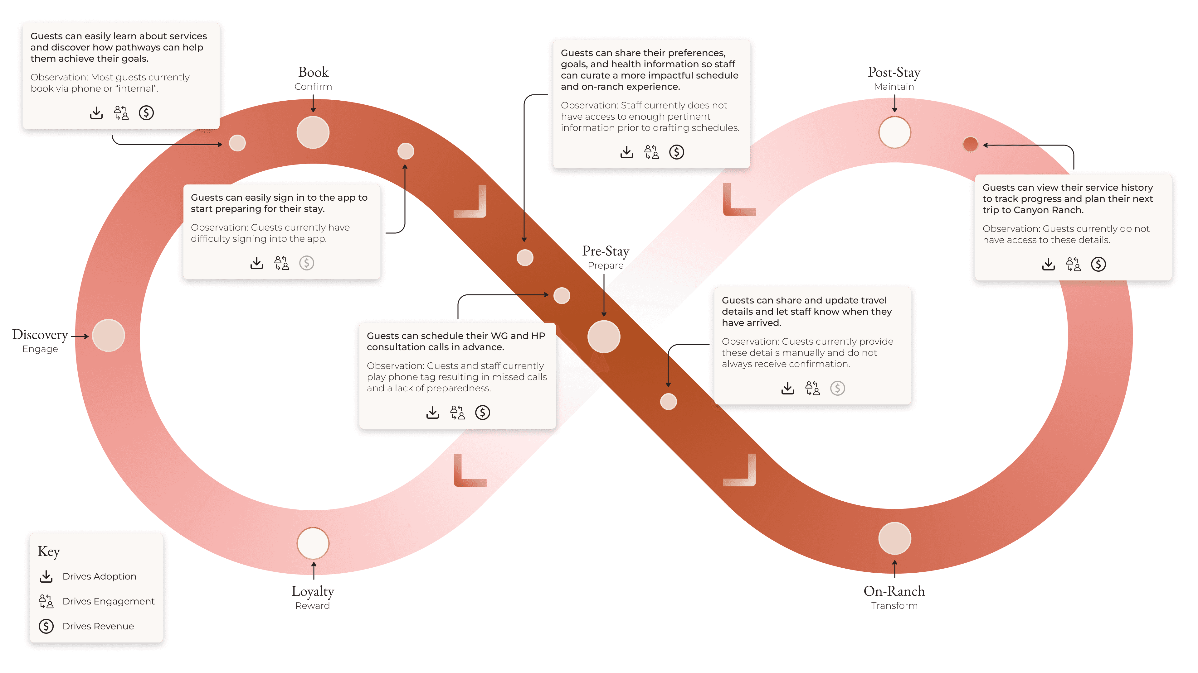
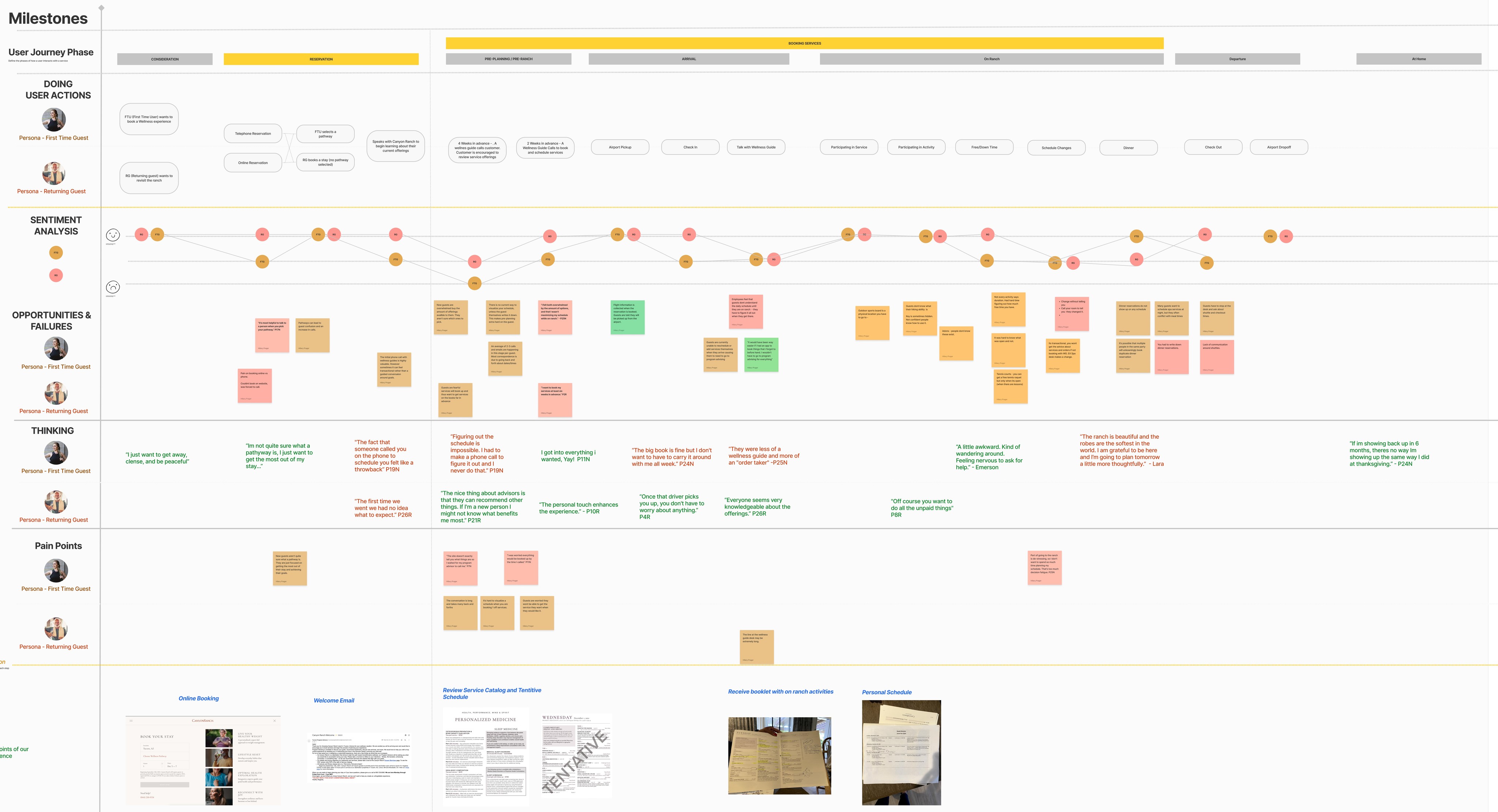
From our experience on the ranch, it became clear that the existing workflow was cumbersome for both guests and staff. To address this, I developed a service blueprint to map out the current process, enabling us to pinpoint the most significant pain points and prioritize our solution around them.
Canyon Ranch Service Blueprint
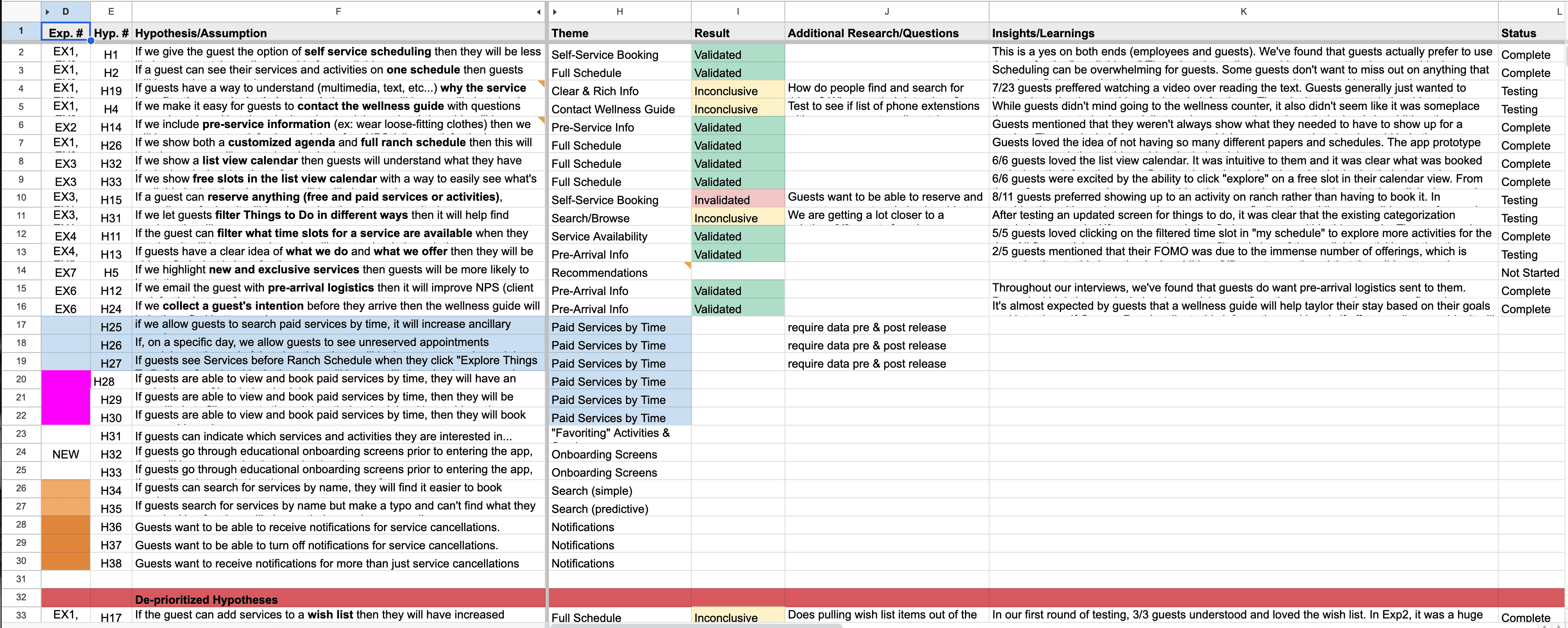
To kick off the solution phase, I facilitated a hypothesis workshop with our primary stakeholders to brainstorm and prioritize potential solutions. We focused on identifying the most impactful ideas and organized them by their potential to address the booking issues at Canyon Ranch. I then led multiple rounds of moderated interviews, each round focused on testing a specific hypothesis, beginning with the highest priority, to validate or invalidate our assumptions.
Simultaneously, I collaborated with the design team to develop initial wireframes, concepts, and eventually low-fidelity clickable prototypes. Our aim was to translate the insights gathered from our on-ranch experiences and guest interviews into a mobile app that could simplify and enhance the booking process.
Initially, we hypothesized that improving the user experience—through better organization of services and categories—would encourage guests to book more services. To test this, I led card sorting exercises, conducted concept testing, and created prioritization guides to inform our design. While these steps helped shape the app’s interface, we quickly realized that the app alone couldn’t replicate the personalized touch that Canyon Ranch excels at.

Our user testing revealed that while some returning guests loved the ability to browse and book services with minimal staff interaction, many first-time guests felt lost. They were unsure which treatments to choose or how to structure their schedules, such as whether to book a massage in the morning or evening. This demonstrated that while an enhanced app experience was valuable, it needed to complement the human connection, not replace it.
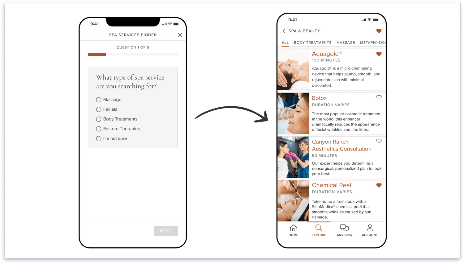
To address this, we designed the app to serve both types of guests. For those who preferred speaking with a wellness guide, the app acted as a research tool, helping them explore services before having more meaningful calls. This resulted in higher-quality interactions and an increase in services booked. For guests who preferred a self-service approach, we implemented a service finder feature that guided them toward services tailored to their preferences. This feature led to a noticeable increase in bookings made directly through the app.
Technology, Build, Launch
The MVP phase of this project was scoped for 6 months, meaning we had to understand the problem, design solutions, and develop a finished product within that time. With such ambitious goals, we began the build process early, even as we were still in the design and research phases.
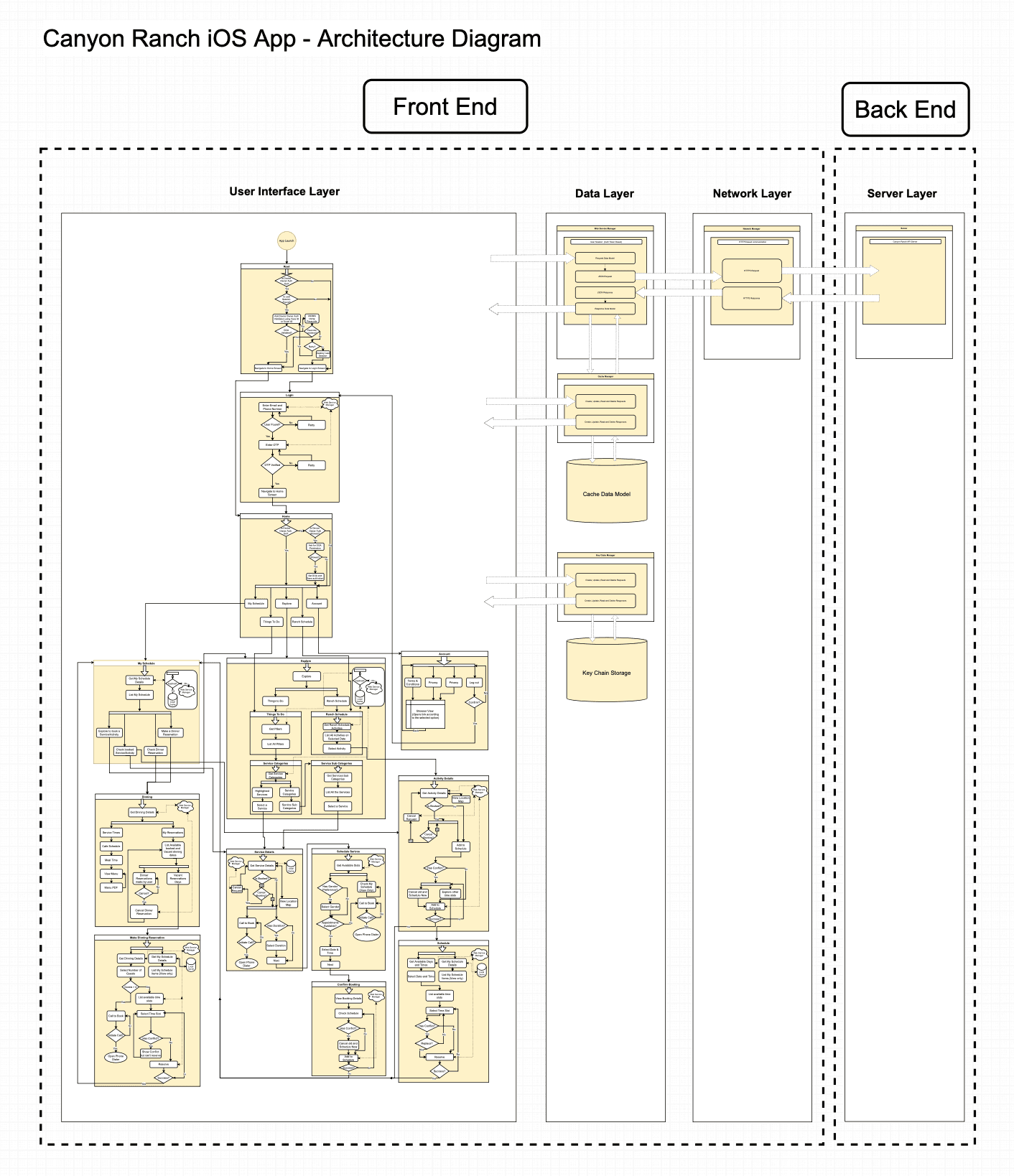
One of the initial technical challenges was integrating the app with both Canyon Ranch's CMS and Book4Time. The service information was scattered across both systems, requiring significant data cleanup. In parallel, we needed to build APIs that would allow the app to book and cancel services, all while adhering to Canyon Ranch’s internal booking hierarchy and queue system. To tackle this complexity, I worked closely with the development team and Canyon Ranch's IT team to create and iterate on an architecture diagram that mapped out the system interactions.
Recognizing that backend progress can be invisible to stakeholders, I made it a priority to communicate how each piece of the backend infrastructure contributed to the final product. This ensured that stakeholders understood the ongoing progress, even when front-end changes were not immediately visible.
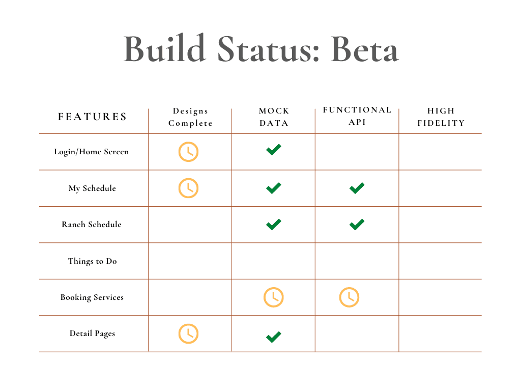
To keep the project on track, I onboarded the team to Jira and led daily scrum meetings, ensuring alignment toward our launch date. Each week, we defined a "most valuable deliverable" for the team, giving everyone a clear focus and providing stakeholders with a transparent view of what to expect each week. Although we followed a formal roadmap, I also broke it down into design and build phases for each feature, ensuring that both the internal team and stakeholders were aligned on progress.
Thanks to this structured approach, we successfully launched the app on time. However, as the project progressed smoothly, stakeholders frequently pushed to add new features. The key to staying on track was maintaining strong communication, sticking to a well-defined roadmap, and addressing blockers quickly as they arose. While we faced numerous challenges during the build phase and often took on more than we had planned, my focus as the project lead was to ensure that the team was always set up for success.
Learnings
Trust and Respect are Key
Trust and respect were key throughout this two-year engagement. Initially, we worked with Canyon Ranch alongside BCG, which meant coordinating efforts across three different teams, all while adhering to tight timelines. As expected, bringing together so many passionate and skilled individuals often led to slow decision-making.
To address this, I found that approaching design and build decisions with a strong, well-informed opinion helped us move forward more quickly. My team was hired for our expertise, and by leading with confidence in our recommendations, we were able to cut through some of the slower processes and make tangible progress. Trusting in our expertise not only sped up the decision-making process but also built stronger respect and collaboration between the teams.
Discuss Design Decisions that Matter Most
In any collaborative project, especially one as complex as this, it's common for everyone to feel like they have input on design. Comments like, "This button should be bigger" or "That information should be above the fold" can quickly derail productive discussions. It's easy for a user flow or journey meeting to turn into a design critique.
To prevent this, journey maps became an essential tool in keeping us focused. When it was time to present designs, I worked closely with my design team to clearly outline what specific feedback we were seeking. This allowed us to guide conversations constructively, ensure stakeholder input was valuable, and ultimately keep the project on track.
Tech Stack Decisions are Insanely Important
Before I joined the project, the decision had already been made to build the app natively, starting with iOS. One of my bigger mistakes was not questioning this decision right away. Although many of Canyon Ranch’s users were on iOS, the company itself didn’t have a dedicated development team at the time. This meant that, with their limited resources, they would eventually need to support two separate apps: iOS and Android.
Ultimately, the app was rewritten in React Native, allowing us to maintain a single codebase. My key takeaway from this experience is that it’s never too late to challenge important decisions when something doesn’t seem right.
HMP 2024
Canyon Ranch

